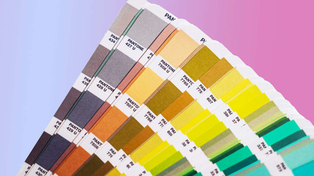
Colour plays a crucial role in website design. It is not just about making a site look visually appealing. It also influences user behaviour, emotions, and decision-making. A well-designed website, using colour theory, can capture attention, convey your brand message, and improve user experience. As a web design agency, we understand the importance of selecting the right colours to create a cohesive and engaging online presence.
Let’s get into the essentials of colour theory, explore different colour schemes for websites, and provide insights on how to design a website that stands out.
Colour theory is the study of how colours interact and affect each other, as well as the emotions they evoke. In website design, it helps designers choose colours that complement each other, create visual balance, and guide the viewer’s eye to key areas. By mastering the colour wheel, which consists of primary, secondary, and tertiary colours, web designers can create a palette that aligns with a brand’s identity and message.
The colour wheel is an essential tool in website design. It allows designers to understand how different colours relate to one another and how they can be combined effectively. For example, primary colours (red, blue, yellow) and their combinations (green, orange, purple) form the basis of various colour schemes for websites. Understanding these relationships is crucial for creating a website design that is both harmonious and effective.
Choosing the right colour scheme is one of the most important steps in website design. Different colour schemes can evoke different emotions and suit various types of content. Here are some popular colour schemes for websites:
This scheme uses varying shades, tints, and tones of a single colour. It creates a minimalist and cohesive look, ideal for professional or clean website designs.
By using colours that are next to each other on the colour wheel, this scheme creates a soothing and visually appealing effect. It’s often used in websites that want to convey a calm and welcoming atmosphere.
This involves pairing colours that are opposite each other on the colour wheel, such as blue and orange. This high-contrast scheme is perfect for making important elements stand out and for adding vibrancy to your web design.
This scheme uses three colours evenly spaced around the colour wheel. It provides a balanced and visually striking design, maintaining harmony while offering contrast.
Different colours evoke specific emotions and reactions from users.
Blue is often associated with trust and stability, making it a popular choice in website design for financial institutions and corporate websites. Red can create a sense of urgency, which is why it is frequently used in call-to-action buttons or sales banners. Green, associated with nature and health, is ideal for eco-friendly and wellness websites.
By leveraging these psychological effects, web designers can create a website that resonates with their target audience.
Designing a website involves more than just understanding colour theory; it also requires expertise in user experience, branding, and digital marketing. A professional web design agency like Soak Digital or Finelight Media can help you choose the right colour schemes for websites, ensuring they reflect your brand identity and attract the right audience. Our team of experts will guide you through every step of the website design process, from conceptualization to execution, to ensure a cohesive and effective online presence.
Colour theory is an invaluable tool in website design. By understanding the basics of the colour wheel and applying effective colour schemes, you can create a site that is visually appealing, engaging, and aligned with your brand’s identity. If you’re wondering how to design a website that captures attention and converts visitors, consider the impact of colour choices.